Heineken CORE programme identity and communications
Pitch, concept, design direction, brand identity
2021
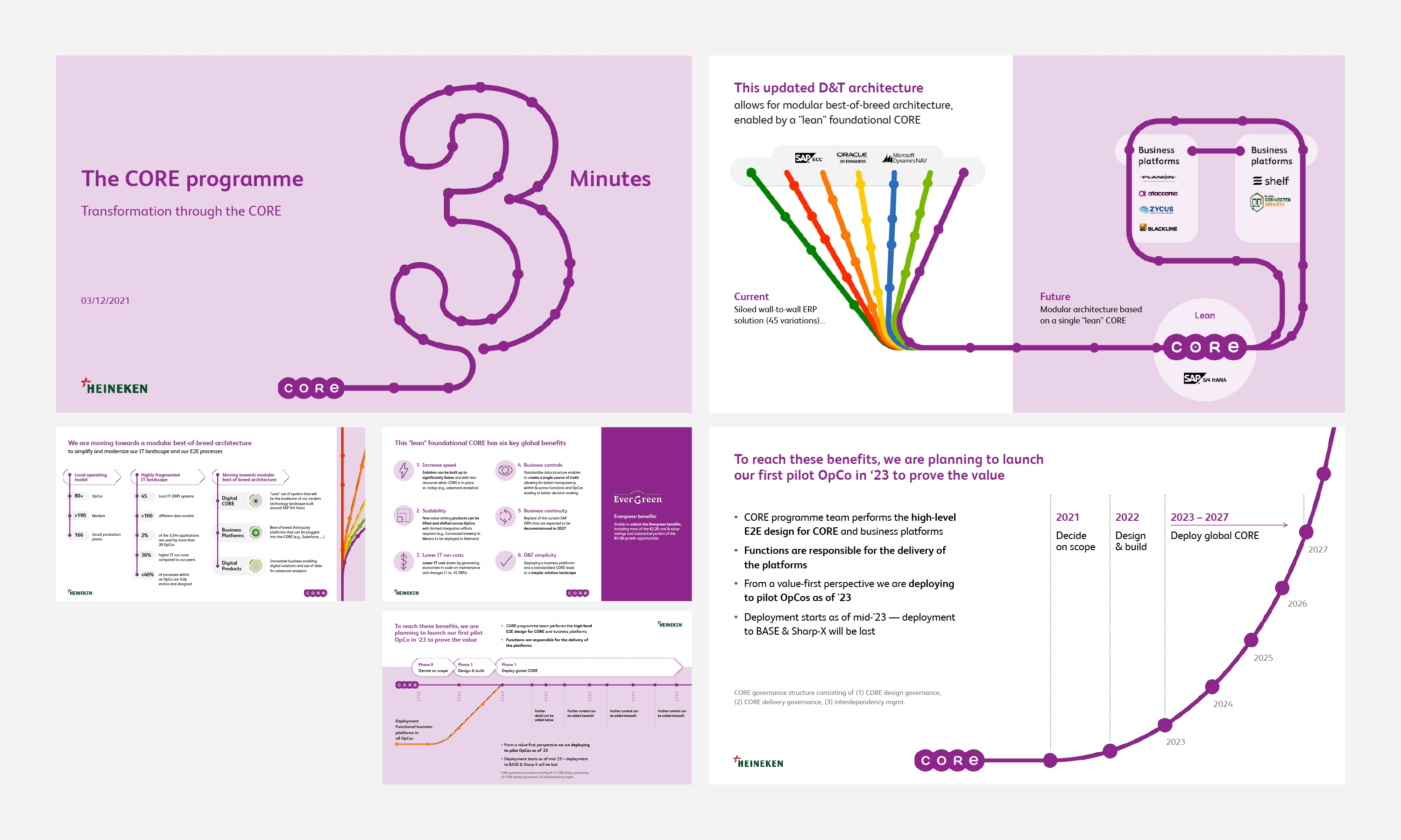
Heineken is on a mission to become the best-connected brewer, to seamlessly link all of Heineken’s regions and business functions across the globe.
They're undertaking a large-scale technology programme to transform the way the global business works across regions, unifying their approach to bring them closer together, they named this programme CORE. To inform and engage their employees Heineken wanted a brand system, an inclusive and easy-to-understand identity to inform and excite their employees.
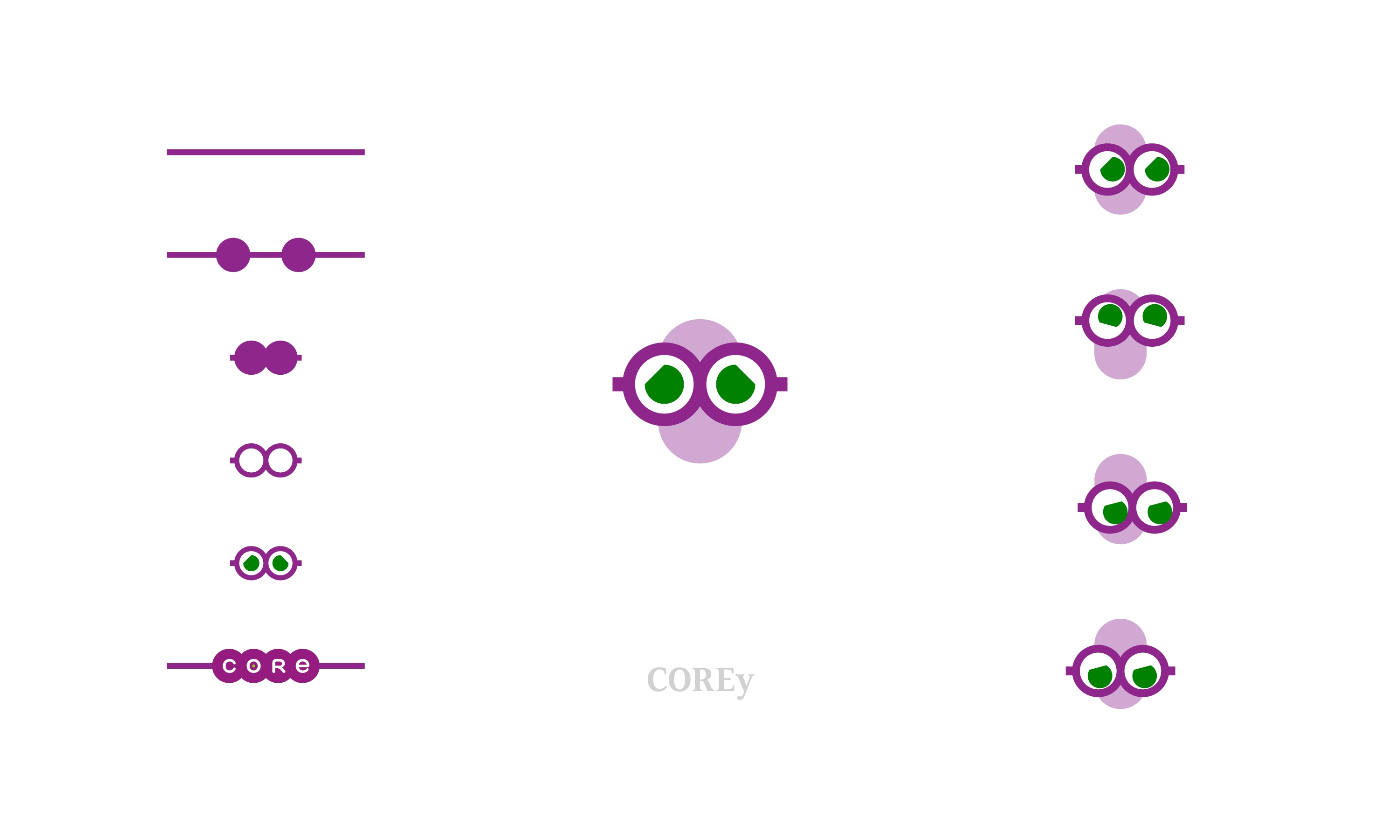
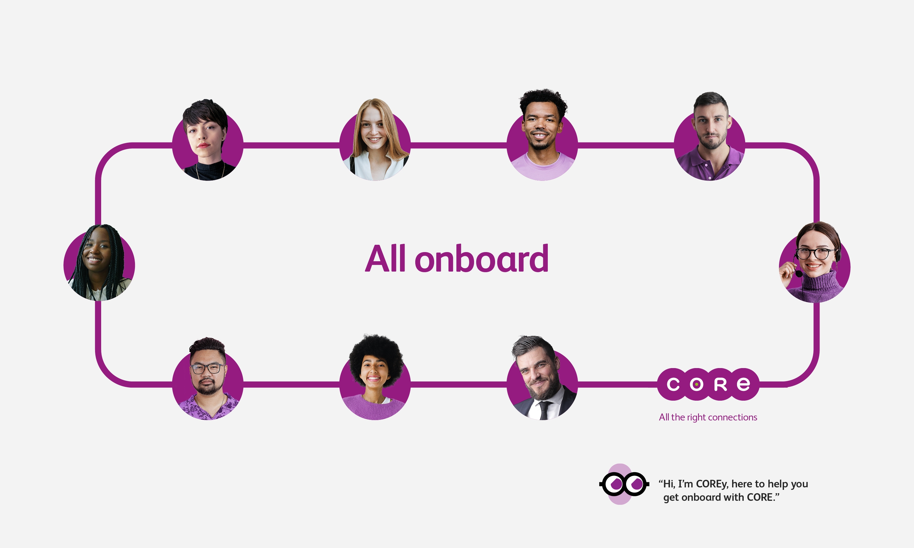
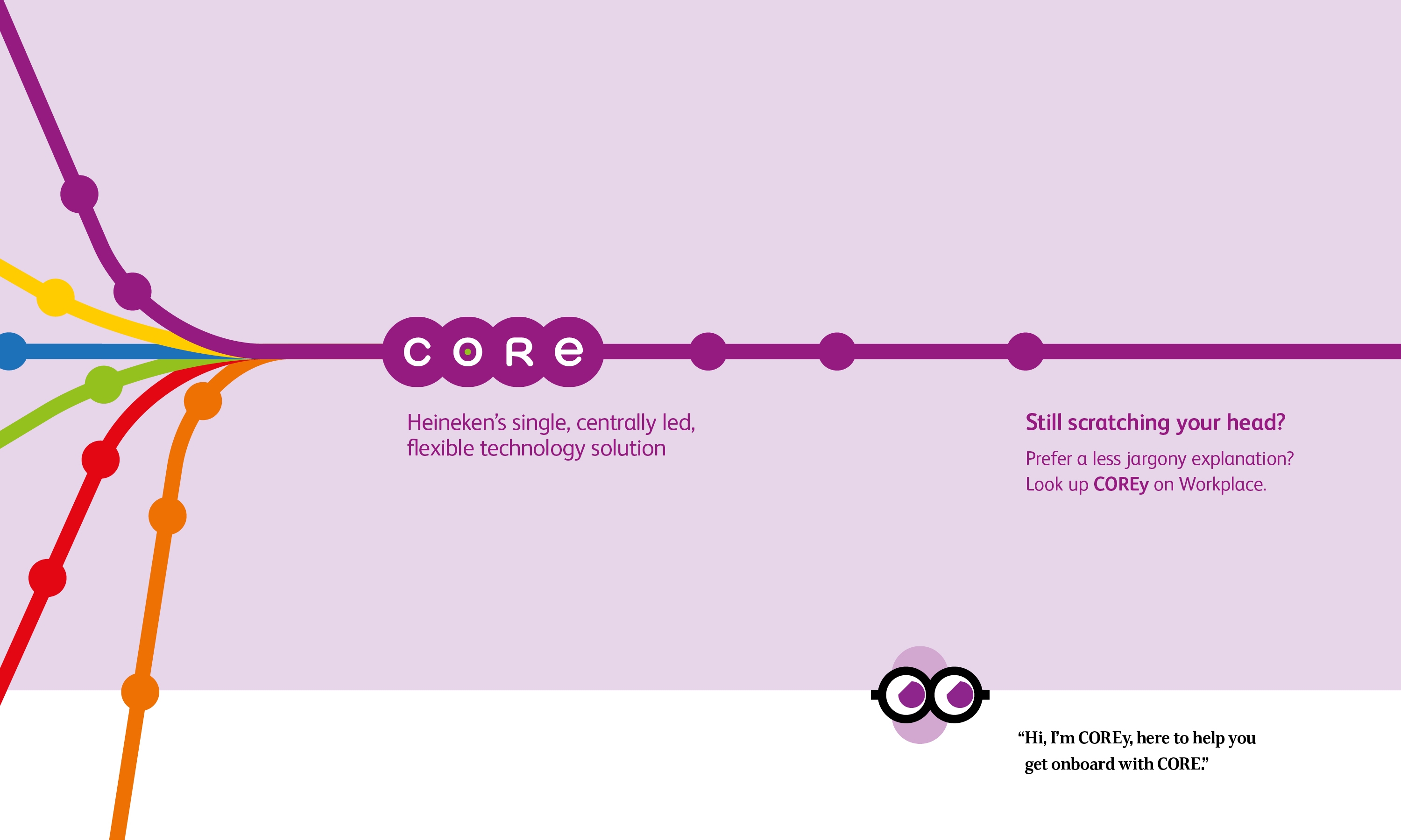
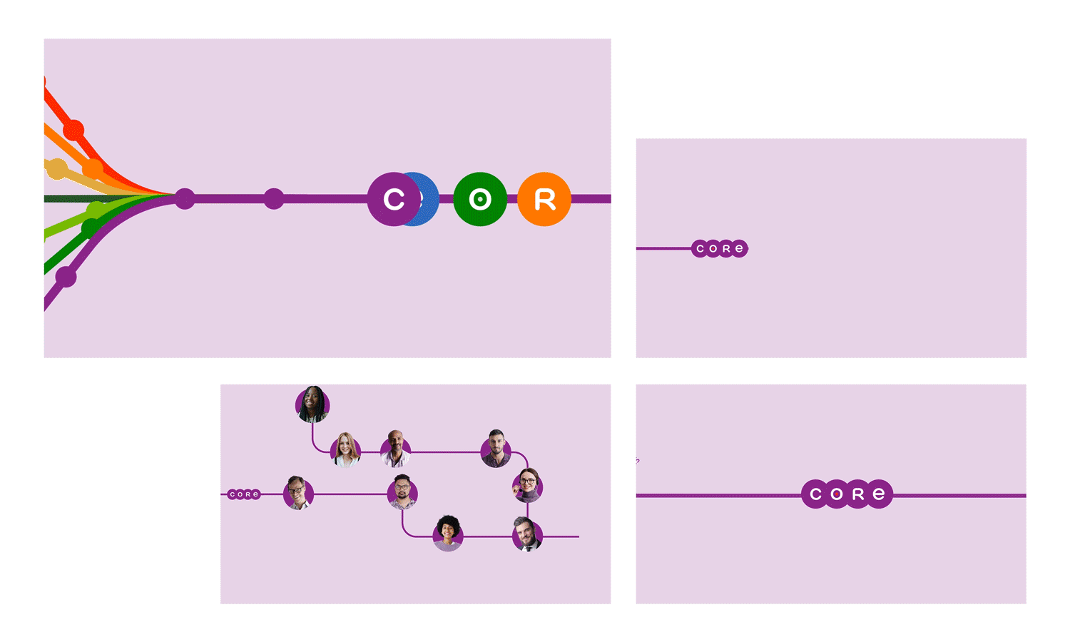
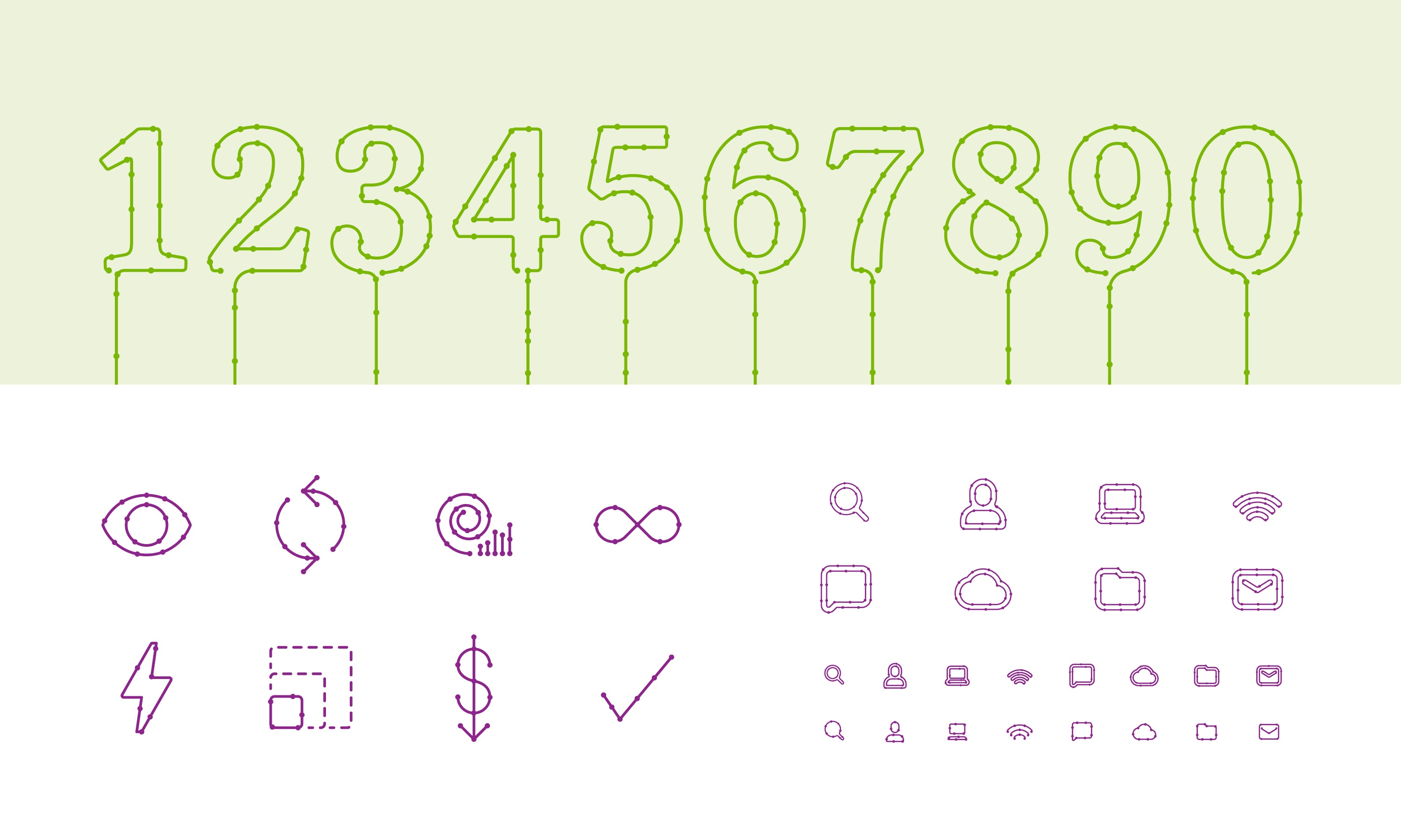
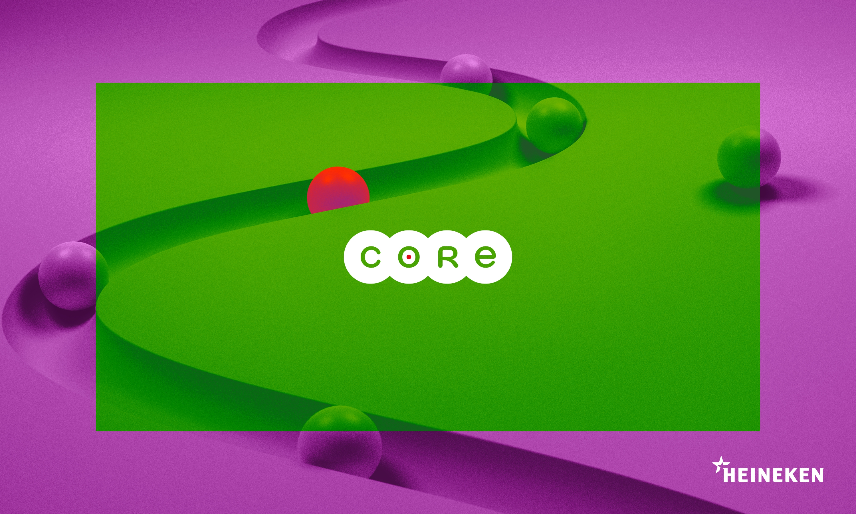
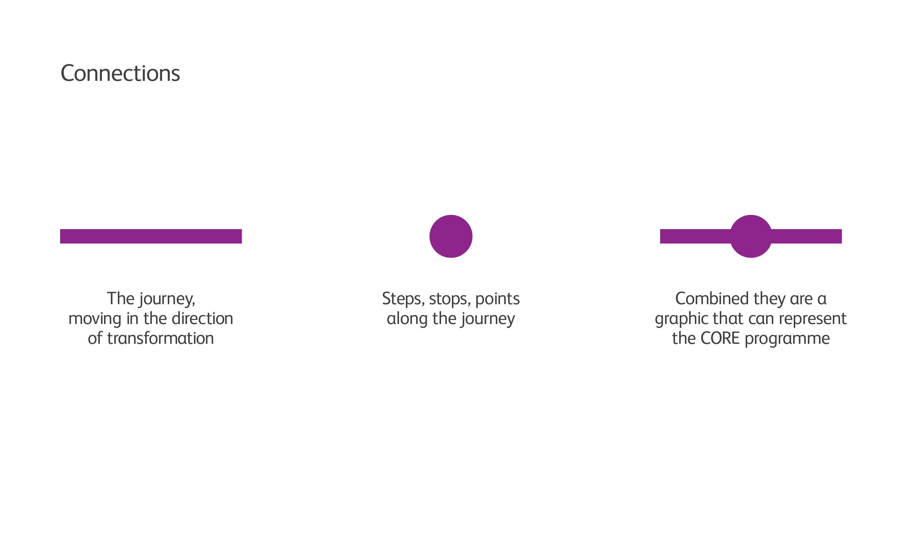
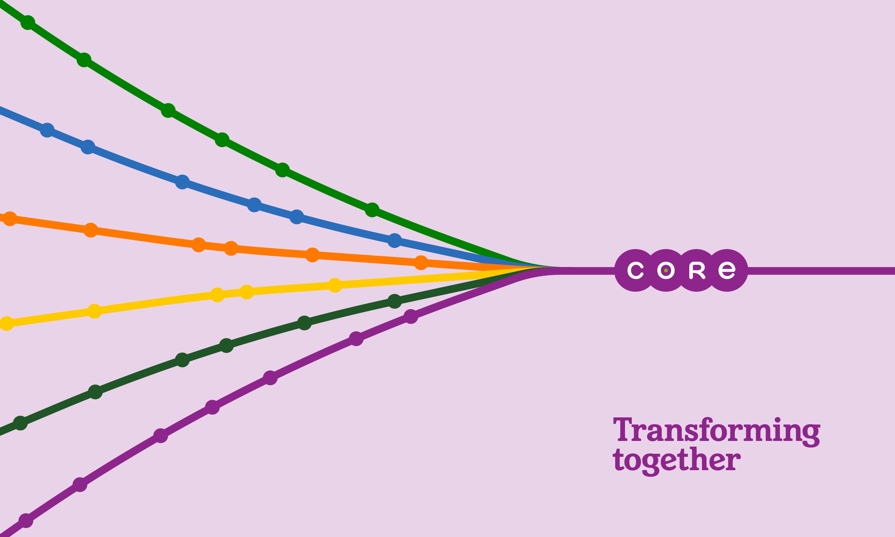
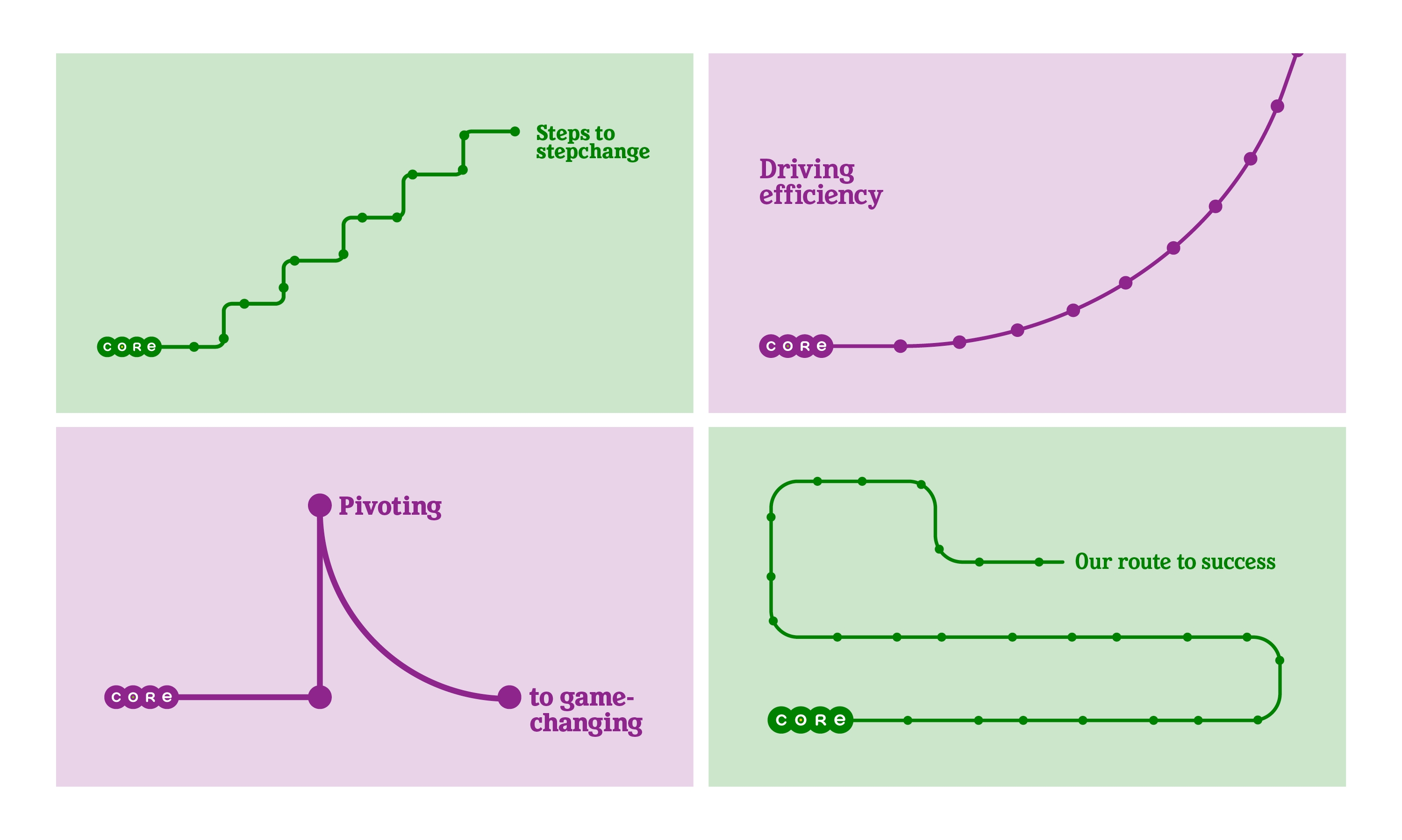
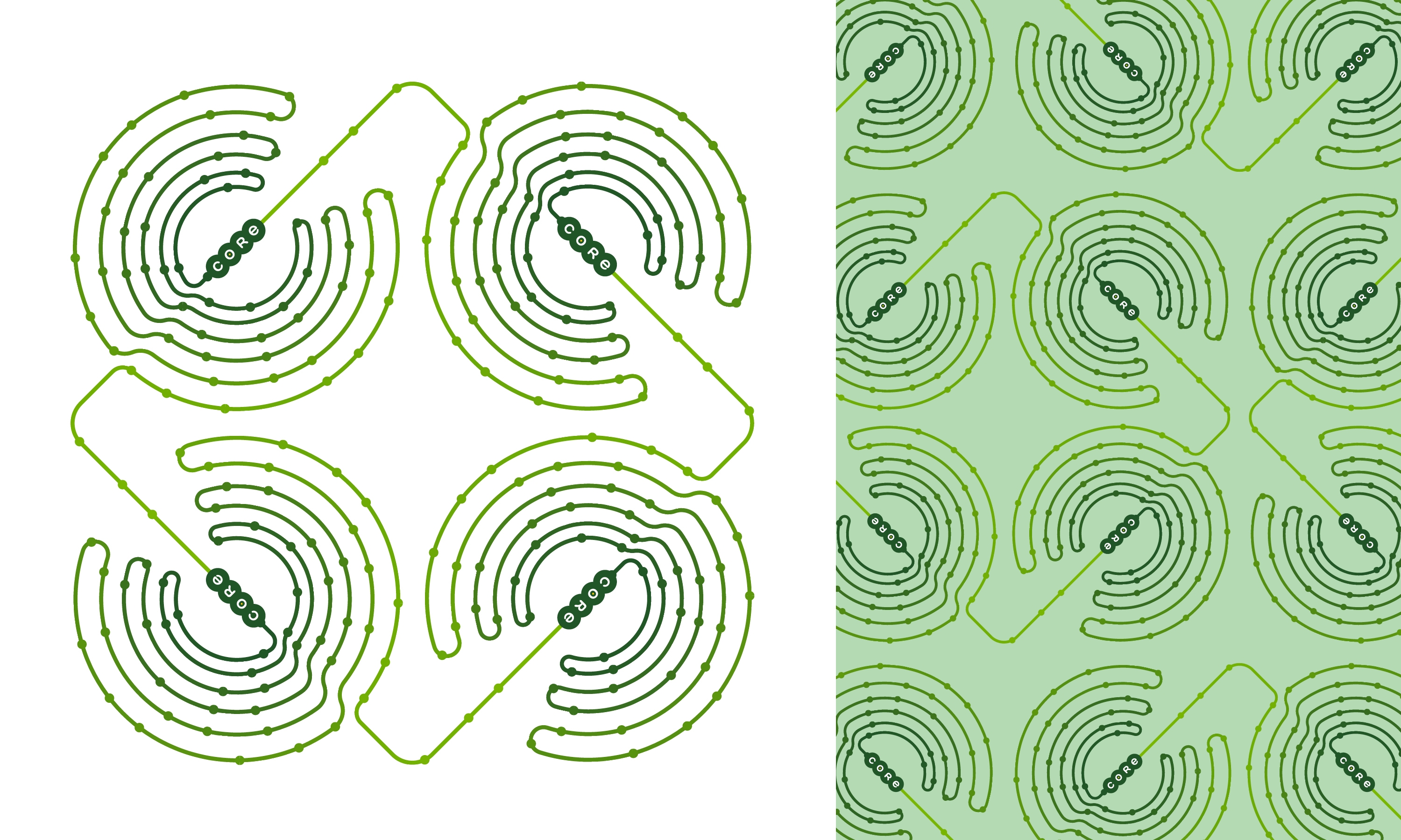
We devised the CORE connections identity to visually bring to life the act of connecting people, locations and operations. Taking a graphic approach, using lines and points along these lines to connect the CORE logo to a network of lines.
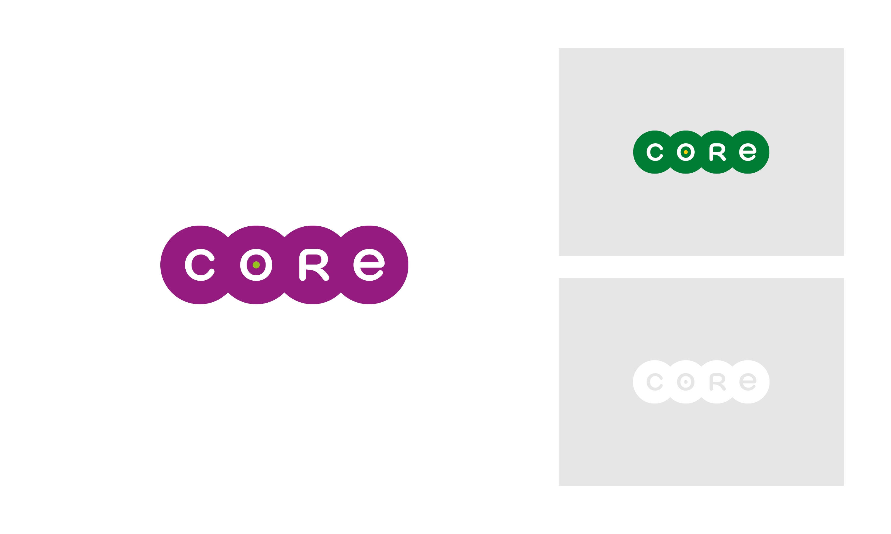
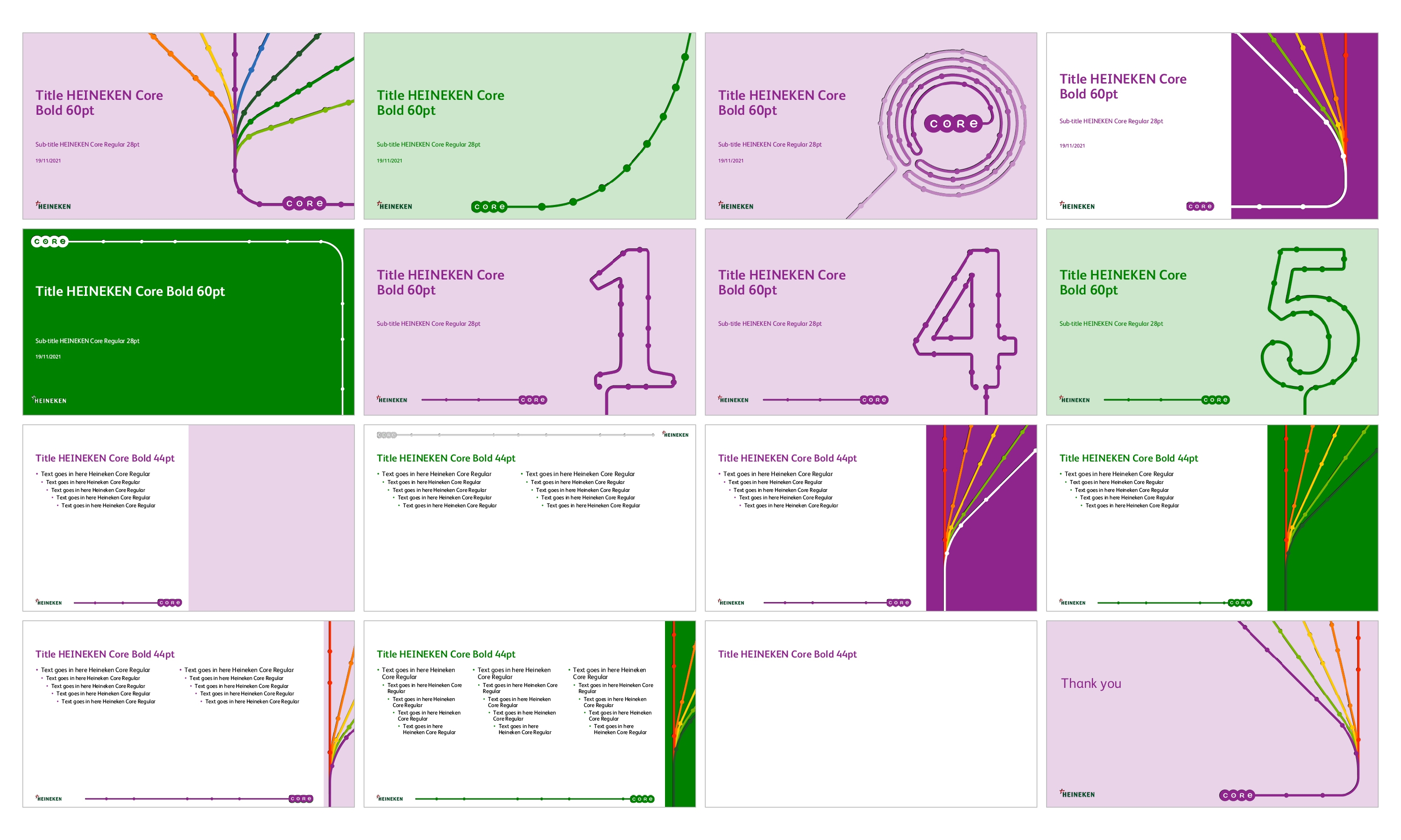
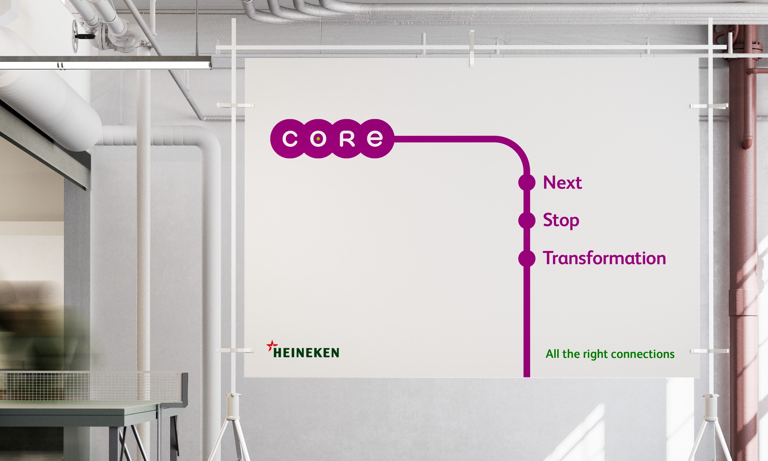
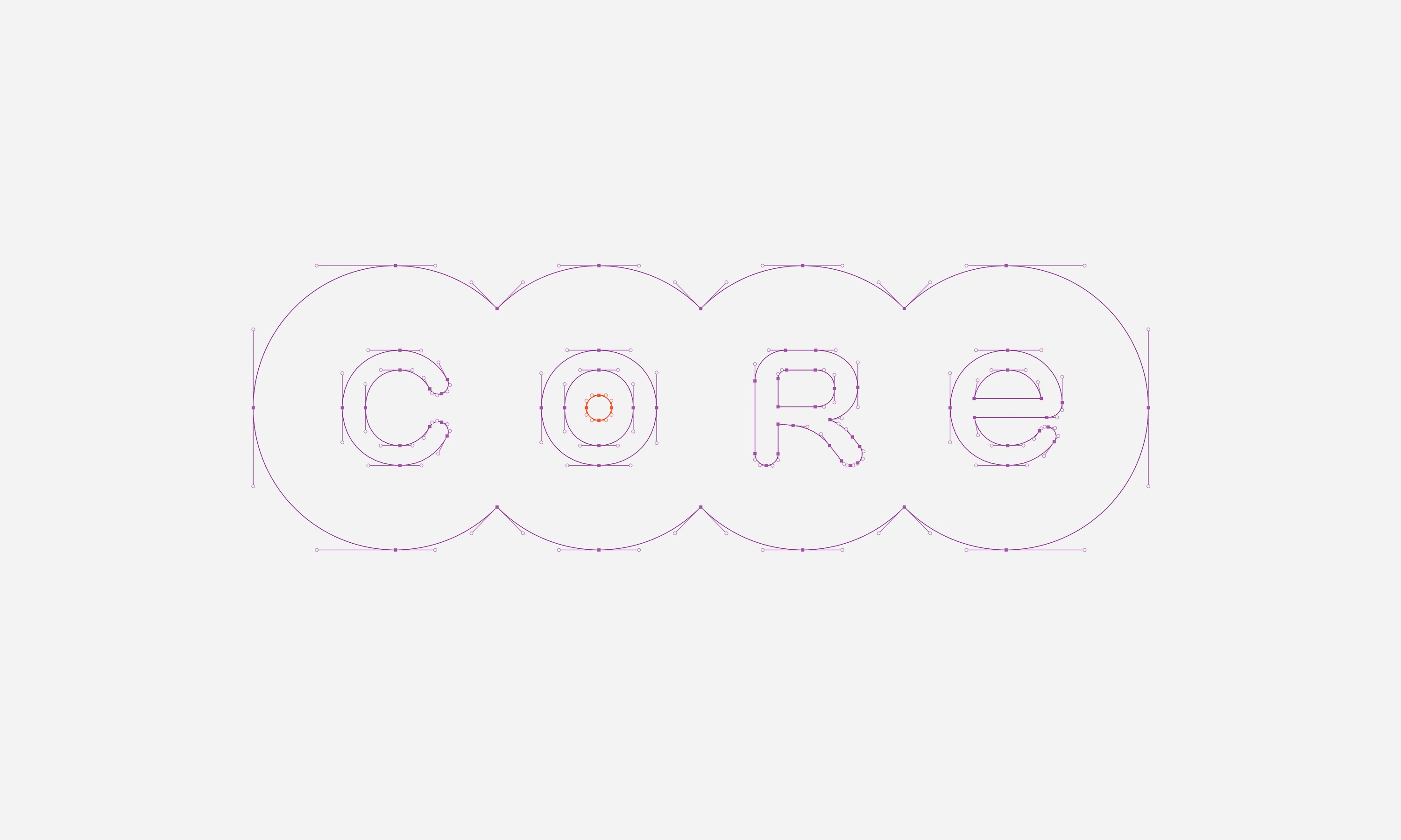
The CORE logo lettering.
Overview of connections identity elements.
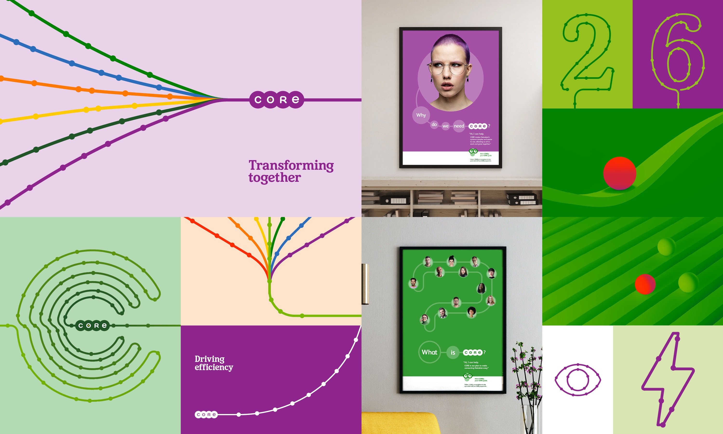
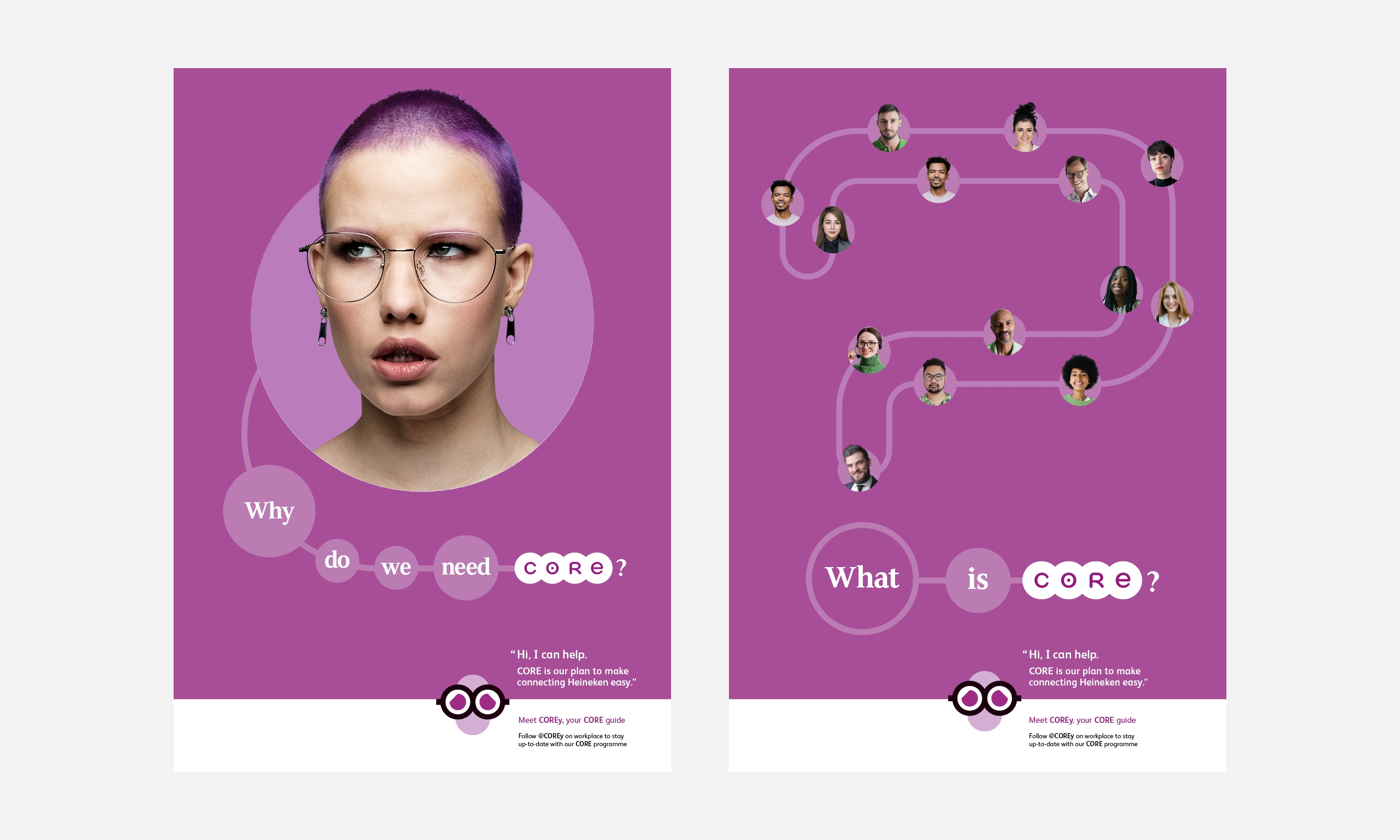
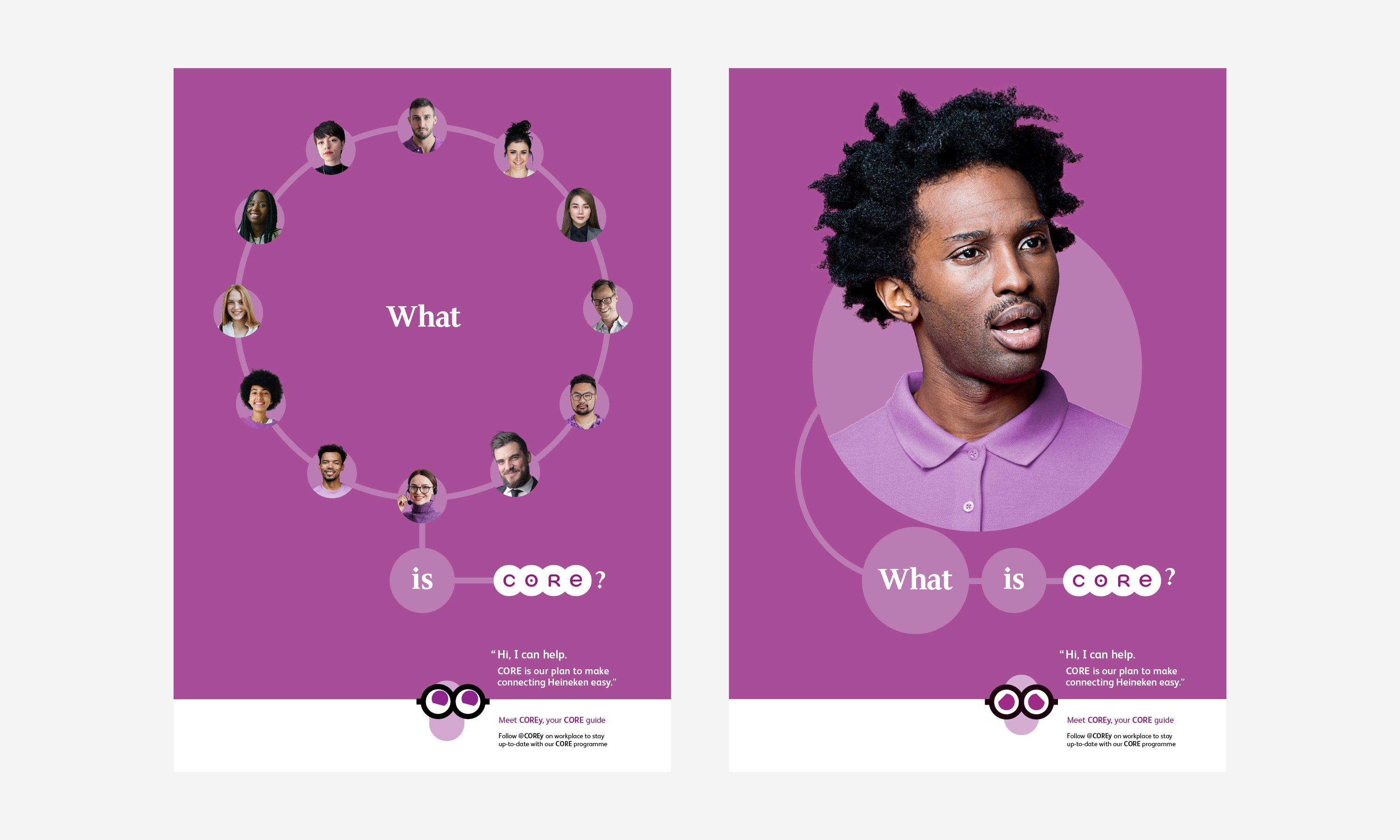
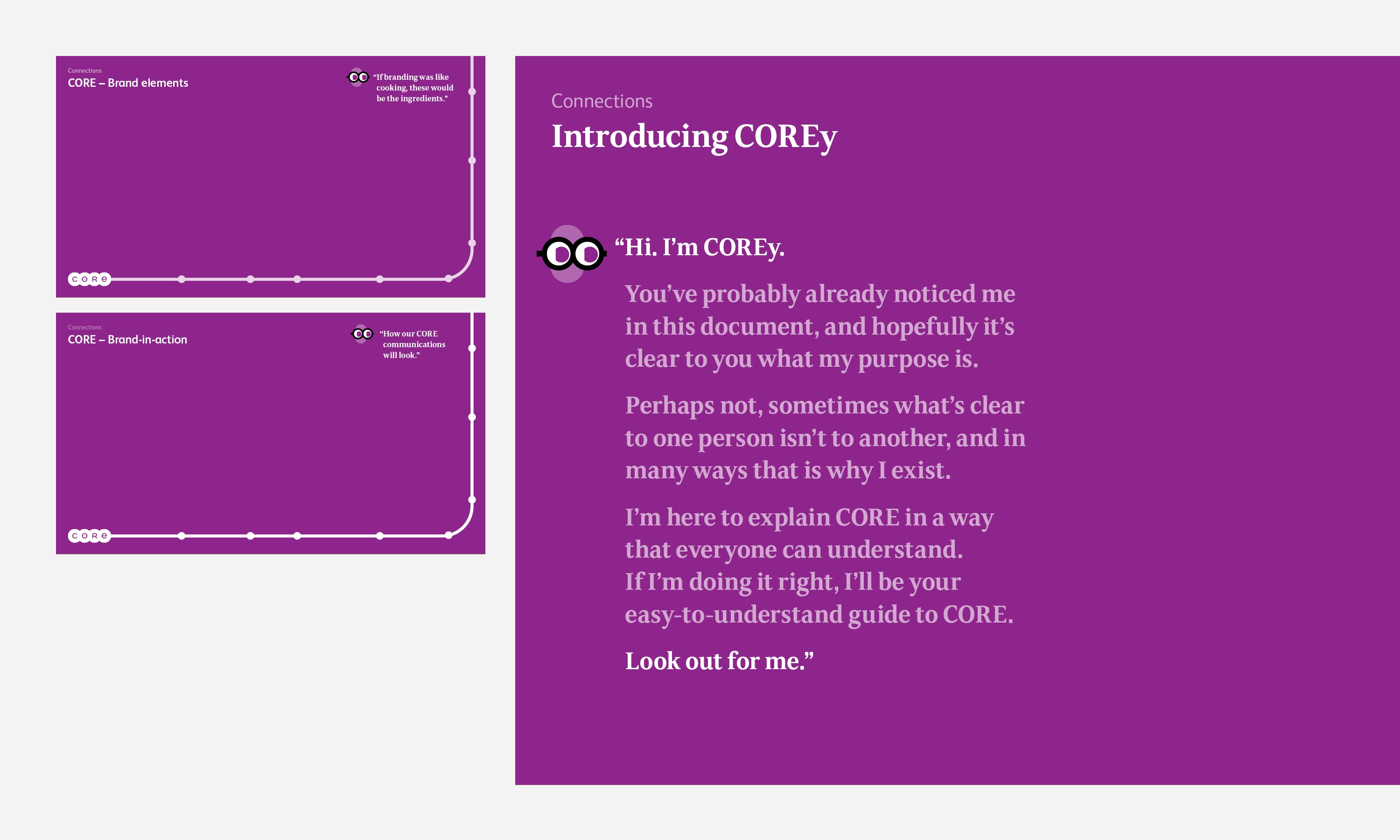
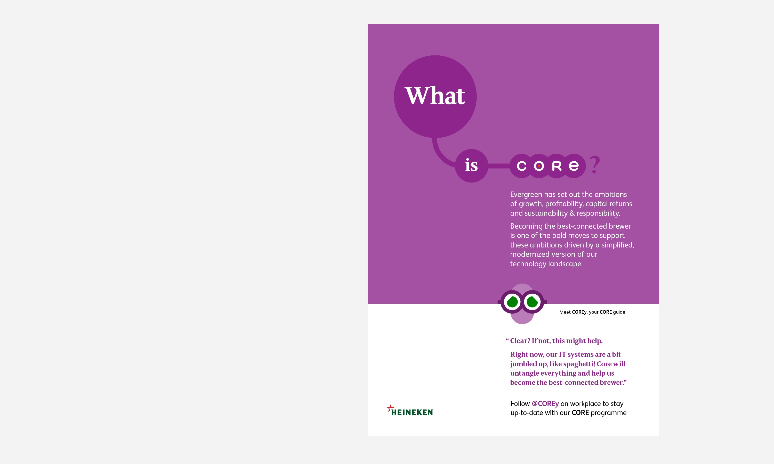
To help explain, in an accessible way, the finer points of CORE we devised a guide, a character that could be used to provide an alternative explanation and answer questions for those not technically minded. We called this COREy, devised to happily sit within the design system.